Redesign using Gestalt Principles, Color, Typeface

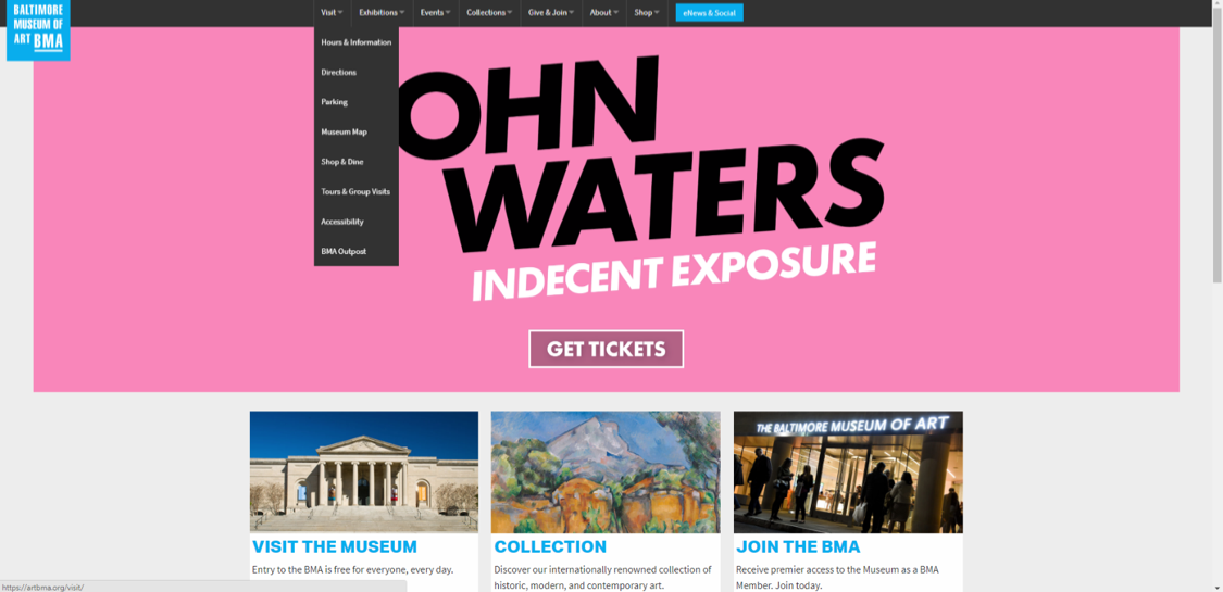
The BMA homepage represents a Flat Design by its use of a simple color, no shading or gradient throughout the homepage. Forgoing the traditional skeuomorphic buttons the static menu appearance is a grey banner with white words and light grey arrows to indicate drop down menus. In the middle of the page there is a 3×3 grid of image and text boxes, when the user hoovers over the text within the information box the text then presents itself as a clickable link by changing color. When scrolling to the bottom there are four rectangles that the user is to presume as clickable buttons due to the fact they change color when they are hoovered over.
Evaluation
In examining the BMA website against Don Norman’s design principles, there are several principles that either fail in their intention or were disregarded for the sake of design. At first glance the static menu bar on top of the site appears promising due to the fact that next to each word or “menu category” there is a grey arrow to signify there is more beyond just the word. When the user hoovers their mouse over each menu category a drop down menu immediately appears and exposes additional navigation options. However, when the user hoovers over the drop down menu items to make a selection there is a lack of signifiers or perceived affordances offered to the user. With no signifiers or perceived affordances the user does not know what items are clickable or when they do click there is no confirmation that they are navigating to the page they wanted. In return decreasing the effectiveness the drop down menu.
Additionally, the overall homepage fails the principle of consistency when it comes to the appearance of the clickable sections. On the main slide banner there is a button to “Get Tickets” however when the user hoovers over the box it does nothing, meaning it does not offer a visual signifier that the box is a clickable feature. However, scrolling further down the homepage other clickable links change color in order to indicate that they are clickable as well as other buttons change to another color when hoovered over to indicate they have digital affordance. By not keeping consistent with how the clickable links operate, the BMA homepage is breaking the consistency principle and has created a set of operations that is not memorable or learnable.
Proposed Redesign using Gestalt Principles, Color, Typeface & Why
Perceived Affordances
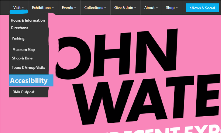
Reducing the whitespace within the dropdown menu will increase item proximity and further emphasize the relatability and grouping of the elements within the menu. Increasing the navigational item proximity within the menu will aid with the item grouping while taking into consideration Fitts’ Law.
To establish figure ground relationship within the menu bar, color will be used as a highlighting feature as well as making the object larger from the menu vertical column. Using these elements will enhance the perceived affordance of clickable elements within the drop down menu. In doing it should aid the user in the navigation choice as well as providing visual feedback that the menu has additional operations.
In addition to color, the typeface will adjust in size and weight to further push the figure ground relationship when the user hoovers over clickable elements. With the introduction of font size scaling and weight this will further differentiate clickable text from the reading text as well as establish a reading hierarchy while guiding the user’s attention. Combining these visual the design concepts the design has been elevated while addressing usability issues which could potentially lead to a negative user experience. For the hoover color, the BMA logo blue was kept as it is used throughout the site to indicate other clickable links and reinforces their branding color. Using the font weight and size to differentiate clickable from non-clickable elements furthers the simple modern design that the BMA is going for and allows the user to clearly see how to navigate within the homepage without feeling overwhelmed. Overall, with making a few simple changes the usability issues of perceived affordance and consistency have been solved while maintaining the BMA’s branding and visual goal of a modern website.

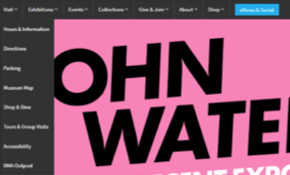
Actual 
Proposed
